When designing for print considering colour is very important. The colour of a design can completely change the way in which it is perceived by the audience. By using specific colours you can come across as assertive, demanding, kind, persuasive, entertaining, etc.
CMYK and halftoning
Source:
http://en.wikipedia.org/wiki/CMYK_color_model
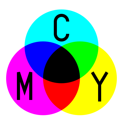
CMYK is the colour mode which is used when printing colours. It stands for Cyan, Magenta, Yellow and Black (key). Cyan, magenta, yellow and black are all spot colours (any colour generated by an ink) and they are used in the four colour printing process. Coloured images are created on paper by applying varying amounts of the four primary inks, made up of small dot, this is called halftoning.
With CMYK printing, halftoning (also called screening) allows for less than full saturation of the primary colors; tiny dots of each primary color are printed in a pattern small enough that human beings perceive a solid color. Magenta printed with a 20% halftone, for example, produces a pink color, because the eye perceives the tiny magenta dots on the large white paper as lighter and less saturated than the color of pure magenta ink.
Without halftoning, the three primary process colors could be printed only as solid blocks of color, and therefore could produce only seven colors: the three primaries themselves, plus three secondary colors produced by layering two of the primaries: cyan and yellow produce green, cyan and magenta produce a purplish blue, yellow and magenta produce red (these subtractive secondary colors correspond roughly to the additive primary colors) plus layering all three of them resulting in black. With halftoning, a full continuous range of colours can be produced.

Benefits of using black:
The "black" generated by mixing commercially practical cyan, magenta and yellow inks is unsatisfactory, so four-color printing uses black ink in addition to the subtractive primaries. Common reasons for using black ink include:
- In traditional preparation of color separations, a red keyline on the black line art marked the outline of solid or tint color areas. In some cases a black keyline was used when it served as both a color indicator and an outline to be printed in black. Because usually the black plate contained the keyline, the K in CMYK represents the keyline or black plate, also sometimes called the key plate.
- Text is typically printed in black and includes fine detail (such as serifs), so to reproduce text or other finely detailed outlines, without slight blurring, using three inks would require impractically accurateregistration.
- A combination of 100% cyan, magenta, and yellow inks soaks the paper with ink, making it slower to dry, and sometimes impractically so. This also can cause the ink to bleed.
- Although a combination of 100% cyan, magenta, and yellow inks should, in theory, completely absorb the entire visible spectrum of light and produce a perfect black, practical inks fall short of their ideal characteristics and the result is actually a dark muddy color that does not quite appear black. Adding black ink absorbs more light and yields much better blacks.
- Using black ink is less expensive than using the corresponding amounts of colored inks.
When a very dark area is desirable, a colored or gray CMY "bedding" is applied first, then a full black layer is applied on top, making a rich, deep black; this is called rich black. A black made with just CMY inks is sometimes called a composite black or process black.
The amount of black to use to replace amounts of the other ink is variable, and the choice depends on the technology, paper and ink in use. Processes called under color removal, under color addition, and gray component replacement are used to decide on the final mix; different CMYK recipes will be used depending on the printing task.
Pantone PMS System
The Pantone Color Matching System is largely a standardized color reproduction system. By standardizing the colors, different manufacturers in different locations can all refer to the Pantone system to make sure colors match without direct contact with one another.
One such use is standardizing colors in the CMYK process. The CMYK process is a method of printing color by using four inks — cyan, magenta, yellow, and black. A majority of the world's printed material is produced using the CMYK process, and there is a special subset of Pantone colors that can be reproduced using CMYK . Those that are possible to simulate through the CMYK process are labeled as such within the company's guides.
However, most of the Pantone system's 1,114 spot colors cannot be simulated with CMYK but with 13 base pigments (15 including white and black) mixed in specified amounts.
The Pantone system also allows for many special colors to be produced, such as metallics and fluorescents. While most of the Pantone system colors are beyond the printed CMYK gamut, it was only in 2001 that Pantone began providing translations of their existing system with screen-based colors. (Screen-based colors use the RGB color model — red, green, blue — system to create various colours.) The Goe system has RGB and LAB values with each colour.
Pantone colors are described by their allocated number (typically referred to as, for example, "PMS 130"). PMS colors are almost always used in branding and have even found their way into government legislation and military standards (to describe the colors of flags and seals). In January 2003, the Scottish Parliament debated a petition (reference PE512) to refer to the blue in the Scottish flag (saltire) as "Pantone 300". Countries such as Canada and South Korea and organizations such as the FIA have also chosen to refer to specific Pantone colors to use when producing flags. U.S. states includingTexas have set legislated PMS colors of their flags. It has also been used in an art project by the Brazilian photographer Angelica Dass which applies Pantone to the human skin color spectrum.

RGB
Source:
http://www.overnightprints.com/difference-between-cmyk-rgb
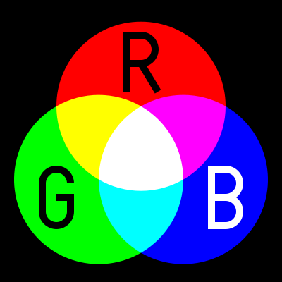
RGB is the color scheme that is associated with electronic displays, such as CRT, LCD monitors, digital cameras and scanners. It is an additive type of color mode, that combines the primary colors, red, green and blue, in various degrees to create a variety of different colors. When all three of the colors are combined and displayed to their full extent, the result is a pure white. When all three colors are combined to the lowest degree, or value, the result is black. Software such as photo editing programs use the RGB color mode because it offers the widest range of colours.
The RGB scheme has a greater range of colors than CMYK and can produce colors that are more vivid and vibrant. These colors are beyond the range of CMYK to reproduce and will come out darker and more dull in print than what is seen on the monitor or display. Because the RGB color mode has the full range of colors, documents shown in CMYK mode will always show up precisely on-screen. RGB colors, however, will not necessarily appear in print as they do on-screen. To accurately print the document or image, it must be converted from its original RGB format to CMYK. It is possible to do this by using software such as Adobe Photoshop or Adobe Illustrator.
Hexachrome
Source:
http://th.pantone.com/pages/pantone/Pantone.aspx?pg=19303&ca=24
Hexachrome is a six colour printing process which was developed by Pantone. The process allows for a wider range of colours to be printed. The process adds orange and green to cyan, magenta, yellow and black, CMYKOG. It allows the colour gamut to expand, so that colours which were seen on the screen could be printed.
Here is a PDF from pantone explaining the Hexachrome colour system:
http://www.pantone.com/downloads/articles/pdfs/art_hex_primer.pdf
'Hexachrome is an ultra-high fidelity six-color process printing system developed by Pantone, Inc. It's large color gamut, compared to four-color process printing, makes it possible for the first time to more accurately reproduce a wide range of both vibrant and subtle colors that can be defined and displayed on computer monitors which previously could not be duplicated in print.
In Hexachrome, the existing CMYK primaries were modified into more chromatic inks, with orange and green being added to the traditional equation. In addition to reproducing more brilliant continuous-tone images, Hexachrome is capable of accurately reproducing over 90% of the PANTONE MATCHING SYSTEM® Colors, almost twice the number that can be obtained using conventional four-color process printing.'

Source:
http://en.wikipedia.org/wiki/Duotone
http://help.adobe.com/en_US/photoshop/cs/using/WSfd1234e1c4b69f30ea53e41001031ab64-778ea.html#WSfd1234e1c4b69f30ea53e41001031ab64-778da
Duotone is a halftone reproduction of an image using the superimposition of one contrasting colour halftone (traditionally black) over another color halftone. This is most often used to bring out middle tones and highlights of an image. The most common colors used are blue, yellow, browns and reds.
Now due to recent advances in technology, duotones, tritones, and quadtones can be easily created using image manipulation programs.
Here is a little bit about duo tones and photoshop:
'About duotones
In Photoshop, duotone refers to monotones, tritones, and quadtones as well as duotones. Monotones are grayscale images printed with a single, non-black ink. Duotones, tritones, and quadtones are grayscale images printed with two, three, and four inks. In these images, colored inks, rather than different shades of gray, are used to reproduce tinted grays.
Duotones increase the tonal range of a grayscale image. Although a grayscale reproduction can display up to 256 levels of gray, a printing press can reproduce only about 50 levels of gray per ink. For this reason, a grayscale image printed with only black ink can look significantly coarser than the same image printed with two, three, or four inks, each individual ink reproducing up to 50 levels of gray.
Sometimes duotones are printed using a black ink and a gray ink—the black for shadows and the gray for midtones and highlights. More frequently, duotones are printed using a colored ink for the highlight color. This technique produces an image with a slight tint and significantly increases the dynamic range of the image. Duotones are ideal for two‑color print jobs with a spot color (such as a PANTONE Color) used for accent.
Because duotones use different color inks to reproduce different gray levels, they are treated in Photoshop as single-channel, 8‑bit, grayscale images. In Duotone mode, you do not have direct access to the individual image channels (as in RGB, CMYK, and Lab modes). Instead, you manipulate the channels through the curves in the Duotone Options dialog box.'
Here is an image I edited in photoshop using duotones, black and pink:

Source:
http://en.wikipedia.org/wiki/Tints_and_shades
In color theory, a tint is the mixture of a color with white, which increases lightness, and a shade is the mixture of a color with black, which reduces lightness. A tone is produced either by mixing with gray, or by both tinting and shading. Mixing a color with any neutral color, including black and white, reduces the chroma, or colorfulness, while the hue remains unchanged.
When mixing colored light (additive color models), the achromatic mixture of spectrally balanced red, green and blue (RGB) is always white, not gray or black. When we mix colorants, such as the pigments in paint mixtures, a color is produced which is always darker and lower in chroma, or saturation, than the parent colors. This moves the mixed color toward a neutral color—a gray or near-black. Lights are made brighter or dimmer by adjusting their brightness, or energy level; in painting, lightness is adjusted through mixture with white, black or acolor's complement.
It is common among some artistic painters to darken a paint color by adding black paint—producing colors called shades—or to lighten a color by adding white—producing colors called tints.
However, this is not always the best way for representational painting, since an unfortunate result is for colors to also shift in their hues. For instance, darkening a color by adding black can cause colors such as yellows, reds and oranges, to shift toward the greenish or bluish part of the spectrum.
Lightening a color by adding white can cause a shift towards blue when mixed with reds and oranges. Another practice when darkening a color is to use its opposite, or complementary, color (e.g. violet-purple added to yellowish-green) in order to neutralize it without a shift in hue, and darken it if the additive color is darker than the parent colour.
When lightening a color this hue shift can be corrected with the addition of a small amount of an adjacent color to bring the hue of the mixture back in line with the parent color (e.g. adding a small amount of orange to a mixture of red and white will correct the tendency of this mixture to shift slightly towards the blue end of the spectrum).

Ittens 7 Contrasts
• Contrast of TONE
• Contrast of HUE
• Contrast of SATURATION
• Contrast of EXSTENSION
• Contrast of TEMPERATURE
• COMPLEMENTARY contrast
• SIMULTANEOUS contrast
*Last years experiment
Contrast of tone
Formed by the juxtaposition of light and dark values. This could be monochromatic. Monochromatic is one colour.
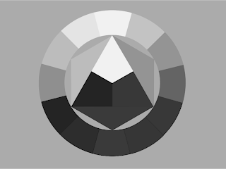
Above is a desaturated colour wheel, the lightest colour is yellow, the darkest colour is blue and the mid tones are red.


You can see here a difference in tone, the last image is harder to read because the tones are closer.
Contrast of Hue:
Formed by the juxtaposing of different hues. The greater the distance between hues on a colour wheel, the greater the contrast.
These are the primary colours which have the biggest difference in hue.

Blue has the highest contrast against the white, due to the tone, making it easier to see. You can see the yellow is harder to look at. If you add a black background the yellow becomes easier to read and the blue becomes harder to read.

Contrast of Saturation:
Formed by the juxtaposition of light and dark values and their relative saturations.

When a colour is more saturatied it becomes more transparrent. We would say a colour is blue because theres nothing to compare it to, but in the above examples you can see that when compared to other saturated colours the colour blue can vary.
Contrast of Extension:
This is placing colours together to form a balance between them.
Here is an example with to complimentary colours. With Violet being the heavier colour, and yellow being very light less violet is needed to weigh out the balance of the colours:

When the colours are split your eyes prefer to look at the bigger block of colour:

For example below, your eyes much prefer to look at the bigger block than the violet split up into lots of lines

Below again, although the colours seem equally spaced out this does not mean that a balane between the colours has been achieved:

Its easier to look at the left than the right:

Contrast of Temperature:
Orange is the hottest, Blue is the coldest.
Here we can see two colours, a red and a redish pink. The right hand colour makes the left hand colours seem much cooler.

If we add an extra red to the right the colour which was once the hottest is now being cooled down by the extra colour which is warmer.

You can also see that when looking between the colours the hotter red almost creates a sort of magenta colour, when infact the columb is one whoel colour.
To ellaborate on this, bellow are two images, one which is seperate by black lines, one which isnt. When the colours are seperated by black lines they look like one single block colour. When the lines are taken away your eyes are tricked into seeing a gradient of colour:


Complementary Contrast:
Formed by juxtaposing complementary colours from a colour wheel or perceptual opposites.
When complimentary colours mix its hard on the eye to look at, here are two examples:


Two of the highest contrasting colours are Red and green:

The yellow is easier to see because if its tone, the blue is harder because its closer to green.
Simultaneous Contrast:
Putting colours next to each other that will have a maximum amount of impact. Formed when boundaries between colours perceptually vibrate.
Green (yellow and blue) and yellow. When you look at it long enough, you see orange, as red is absent. The yellow blurs into the green, due to the green holding yellow. The blue is forced as green, which then forces out its complimentary (orange) in the yellow.

No comments:
Post a Comment