Boost energy
'Simon Gray established Boost Drinks in 2001 and it is now the UK’s 2nd largest energy drinks brand with nearly 20 different products across the Boost Energy, Boost Active and Boost Sport ranges. It is the only brand that covers all three sectors of functional drinks – stimulation energy, glucose and sports/isotonic.
'Simon Gray established Boost Drinks in 2001 and it is now the UK’s 2nd largest energy drinks brand with nearly 20 different products across the Boost Energy, Boost Active and Boost Sport ranges. It is the only brand that covers all three sectors of functional drinks – stimulation energy, glucose and sports/isotonic.
Gray was a drinker of energy drinks and realised there was no branded, value alternative, so spotted an opportunity to launch one to the market.
Recent additions to its range include Boost Sport in Tropical Berry flavour and Boost Citrus Energy.
Boost’s marketing campaign message is ‘It’s a no brainer’, which refers to the fact that Boost offers great tasting products at a great price. The brand is actively promoted through advertising, PR and social media channels. It can be found on Facebook at www.facebook.com/boostenergydrinks and on Twitter at www.twitter.com/boost_drinks . Its website address is www.boostdrinks.com .
In 2011, Boost sold five million cases of its products. As well as being sold across Ireland and the UK, Boost also exports to 16 countries around the world including Sweden, Spain, Brazil, Sri Lanka and South Africa.
Boost has its headquarters in Leeds, West Yorkshire.'
Below are some screen shots of the pack information we received:


Above are the rangers which boost already provide. It's clear that they are aimed at sporty individuals. The aesthetics of the bottles are very colourful and in your face.


We came to the conclusion that the bottles were very tacky. The font used is very clunky, and the gradient effect on the side is quite cheesy. I think we are going to go down the route of keeping everything quite minimal and clean.
Other energy drink aesthetics:
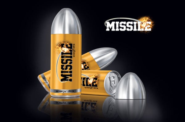
Very different packaging, in the shape of a bullet. It's very masculine which is not something we are aiming towards.

Here is a selection of energy drinks on the market. They are all very in your face, quite sporty, mainly dark with bright colours. In my opinion they're all a bit tacky.

Love this simple design and the character works really well.


A very different approach to a bottle shape, this would definitely stand out on the shelf.

Very minimal and simple, I like the white and the use of pink.

Really like the mockup proposal, we could approach our proposals in a similar way, using liquid to make the bottle look first quenching and hydrating.

Really like this design, the colourful patterns really make it stand out. I like the bottle shape as well, it's different.

Very peculiar shape but works really well, maybe a little bit tacky for my liking.

Very in your face, love the pink and the black. I maybe would buy it as a healthy energy drink, but it works well and would stand out.

Really like this simple design, love the illustration and the colours.
My partner made these boards for the presentation tomorrow for an understanding of what we are trying to achieve:


My partner made these boards for the presentation tomorrow for an understanding of what we are trying to achieve:
No comments:
Post a Comment