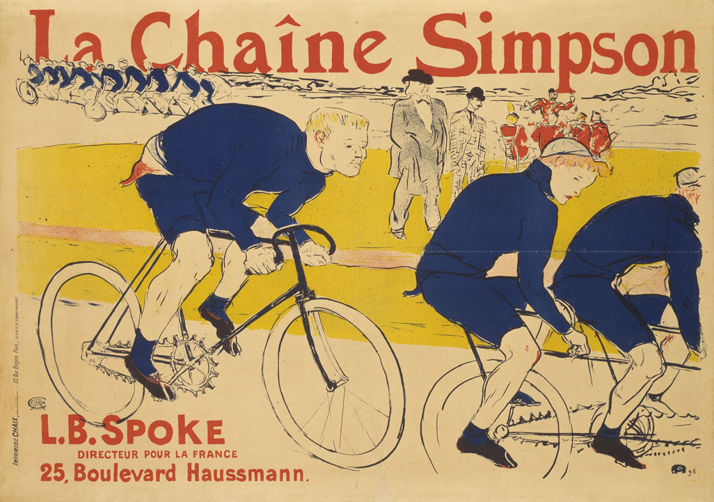
For the practical side of my essay I want to explore classic graphic design styles, for example art nouveau, early modern, Art Deco, psychedelic etc. From this I would like to reproduce the posters in a swiss style. Backed up from evidence in my essay, a lot of work now has taken on a very modernist swiss design style, I believe I can reproduce these posters to fit in with the design styles of today.
I'm going to look at work which has been produced during the twentieth century, before the invention of the internet, as I believe this was an era when Graphic Design started becoming referred to as an actual job, and an era when a style could be recognised as being from a specific country.
Below is some information about the history of graphic design, I want to look at the most famous pieces of graphic design, as well as pioneers with a set style:
Source: http://en.wikipedia.org/wiki/History_of_graphic_design
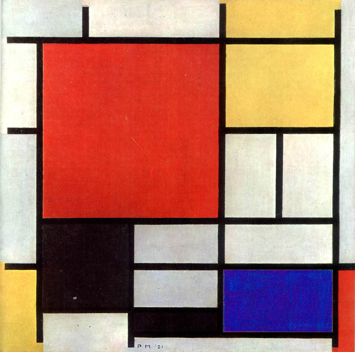
Mondrian's minimalism revolution
Less is more. That is the basic premise of a minimalist color poster design. The Dutch painter Piet Mondrian in the years 1920-21 courageously introduced the style ofminimalism in painting. His simple geometric compositions, together with the use of only three basic colors, blue, yellow, and red, in combination with black and white created a new venue for the graphic designers. He demonstrated that with simple relocation of these colors, and experiment with the proportionality of various square surfaces one can achieve extremely different ambiances and various feelings. For the graphic designers who intend to convey a message with a minimum interference from the extraneous elements his experiment in minimalism was a valuable gift.
Pioneers of modern graphics and industrial design
In 1907, AEG(Allgemeine Elektricitäts-Gessellschaft) retained Peter Behrens, a German architect and designer, as artistic consultant. He designed the entire corporate identity (logotype, product design, publicity, etc.) and for that he is considered the first industrial designer in history. He never became an employee of AEG, but worked as an artistic consultant.
.svg/1600px-Allgemeine_Elektricit%C3%A4ts-Gesellschaft_(logo).svg.png)
Paul Rand an American graphic designer, is best known for his corporate logo designs. His career began with a part-time position creating stock images for a syndicate that supplied graphics to various newspapers and magazines. Between his class assignments and his work, Rand was able to amass a fairly large portfolio, largely influenced by the German advertising style Sachplakat (object poster) as well as the works of Gustav Jensen.
Raymond Loewy was one of the best known industrial designers of the 20th century. Born in France, he spent most of his professional career in the United States. Among his many contributions were the Shell logo, the Greyhound bus, the S-1 locomotive, the Lucky Strike package, Coldspot refrigerators and the Studebaker Avanti. Loewy was first approached by the greyhound corporation to redesign its logo. The company's logo looked like a 'fat mongrel' he said. So, he created a slimmed-down version that is still used today.
William Golden is one of the pioneers of American graphic design. He was born in lower Manhattan, the youngest of twelve children. His only formal schooling was at the Vocational School for Boys, where he learned photoengraving and the basics of commercial design. In conjunction with the Didot typeface, Golden developed the famous CBS Eye logo. It has been suggested that the eye was inspired by an article in Alexey Brodovitch's Portfolio about the subject of Shaker design.


Psychedelic design
The word "psychedelic" means "mind manifesting". Psychedelic art is art inspired by the psychedelic experience induced by drugs, and refers above all to the art movement of the 1960s counterculture. Psychedelic visual arts were a counterpart to psychedelic rock music. Concert posters, album covers, lightshows, murals, comic books, underground newspapers and more reflected revolutionary political, social and spiritual sentiments inspired by psychedelic states of consciousness.
Although San Francisco remained the hub of psychedelic art into the early 1970s, the style also developed internationally. Pink Floyd worked extensively with London based designers, Hipgnosis to create graphics to support the concepts in their albums like this cover of Soundtrack from the Film 'More'. Life magazine's cover and lead article for the September 1, 1967 issue at the height of the Summer of Love focused on the explosion of psychedelic art on posters and the artists as leaders in the hippie counterculture community.
Yellow Submarine was a milestone in graphic design, inspired by the new trends in art, it sits alongside the dazzling Pop Art styles of Andy Warhol, Martin Sharp, Alan Aldridge and Peter Blake. Heinz Edelman was hired by TVC as the art director for this film. Before making Yellow Submarine, TVC had produced The Beatles, a 39 episode TV series "produced" by Al Brodax and King Features. Despite the critical acclaim of his design work for the film, Edelman never worked on another animated feature.
Peter Max's art work was a part of the psychedelic movement in graphic design. His work was much imitated in commercial illustration in the late 1960s and early 1970s. In 1970, many of Max's products and posters were featured in the exhibition "The World of Peter Max" which opened at the M.H. de Young Memorial Museum in San Francisco. He appeared on the cover of Life magazine with an eight-page feature article as well as The Tonight Show Starring Johnny Carson and The Ed Sullivan Show.
Poster design in Japan
The distinctive aesthetics of Japanese graphic design have been admired over many decades, winning awards at prestigious international venues.
The works of Japanese graphic designers are noted for their resourcefulness, powerful visual expression and extraordinary technical quality of print.
The distinctive artistic language and typographic sophistication show particularly in Japanese poster-design. The Japanese poster is a compelling pictorial medium and an original work of art, reflecting in full the designer's creative talent.


Chinese cultural revolution
The poster "Revolution promotes production", created by He Shuxui, celebrates traditional ceramic painting techniques. A plaque in the background commemorates a group of ceramic workers as an outstanding productive unit, 1974.
A worker named Wang Qing Cang created the poster "The three countries of Indo Zhina (Lao, Cambodia, Vietnam) will win!". On the upper left side, it says "Enemies are getting sicker and sicker every day, and we are getting better and better every day." (The U.S. supported Indo Zhina (Indochina) governments while China supported their communist guerilla forces.) October 1964.
The poster "Mao Ze Dong at Jing Gang Mountain" depicts a young Mao Ze Dong sitting against a background of Mount Jing Gang. Jing Gang Shan (Jing Gang Mountain) symbolizes the Mao Ze Dong leadership and his vision to unite the oppressed masses to fight against and fight against the ruling class. Created by Liu Chun Hua and Wang Hui, October 1969.
The poster, "Time is Money", features the famous Canadian doctor Norman Bethune (Dr. Bai Qiuen in Chinese), racing to rescue another patient. Bethune became an early proponent of universal health care, the success of which he observed during a visit to the Soviet Union. As a doctor in Montreal, Bethune frequently sought out the poor and gave them free medical care. As a thoracic surgeon, he traveled to Spain (1936–1937) and to China (1938–1939) to perform battlefield surgical operations on war casualties. Created by Zhang Xin Gua. Hebei People's Publishing House.
German Plakatstil, "Poster style"
In the early 20th century, Germany became the cradle of many of the avant-garde art movements particularly for posters. This created the "Plakatstil" or "Poster style" movement. This movement became very influential and had a considerable impact on the graphic design for posters. Posters in this style would feature few but strong colours, a sharp, non-cluttered, minimal composition and bold, clear types.
Ludwig Hohlwein was born in Germany in 1874. He was trained and practiced as an architect until 1906 when he switched to poster design. Hohlwein's adaptations of photographic images was based on a deep and intuitive understanding of graphical principles. His creative use of color and architectural compositions dispels any suggestion that he uses photos as a substitute for creative design.
Hohlwein was born in the Rhine-Main region of Germany, though he and his work are associated with Munich and Bavaria in southern Germany. There were two schools of Gebrauchsgrafik in Germany at the time, North and South. Hohlwein's high tonal contrasts and a network of interlocking shapes made his work instantly recognizable.
Poster historian Alain Weill comments that "Hohlwein was the most prolific and brilliant German posterist of the 20th century... Beginning with his first efforts, Hohlwein found his style with disconcerting facility. It would vary little for the next forty years. The drawing was perfect from the start, nothing seemed alien to him, and in any case, nothing posed a problem for him. His figures are full of touches of color and a play of light and shade that brings them out of their background and gives them substance"


With nothing to lose, Lucian Bernhard entered a poster contest for the Priester Match Company. The judges, found this poster bizarre, and ignored it. However Ernst Growald, sales manager for Berlin's leading proto-advertising agency and poster printer, saw the discarded poster and exclaimed: "This is my first prize. This is genius!" Bernhard had won both the contest and a long-term benefactor.

Born near Stuttgart as Emil Kahn, he changed his name to Lucian Bernhard and left home for Berlin at the age of 18 in 1901. He became the protege of Edmund Edel, an established artist, who brought him into contact with the printing company and poster publisher Hollerbaum & Schmidt. His first poster, for a match company, became an immediate success. In 1903, he opened his own studio in the center of Berlin. He left Berlin in 1922, and set up a studio in New York City.
1972 Olympics and Otl Aicher posters
The internationally recognised artist Otl Aicher was a graphic designer, urban planner, photographer, and the mastermind behind the imagery for the 1972 Munich Olympics and the Rotis typeface. Growing as a child in Nazi Germany, Aicher, along with his friends Hans and Sophie Scholl, organized the anti-Nazi political organization Die Weisse Rose (the White Rose). In 1943, the Scholls and Aicher were arrested by the Nazi party. While Aicher was released, the Scholls went to trial where they were found guilty of treason and executed. After the war Aicher went on to help rebuild his ravaged city of Ulm and to found the influential international school of design, Hochschule für Gestaltung (HfG).


A partial history of British graphic design
Source: http://www.creativereview.co.uk/back-issues/creative-review/2012/may/crit-a-partial-history-of-british-design
Graphic Design/Pioneers of Graphic Design
Source: http://en.wikibooks.org/wiki/Graphic_Design/Pioneers_of_Graphic_Design
M.F. Agha
Agha was an emigre who was art director for Conde-Nast magazines.
Charles Anderson
Anderson works in a retro (30s-40s) style. He has been creating designs for Fossil watches and tins.
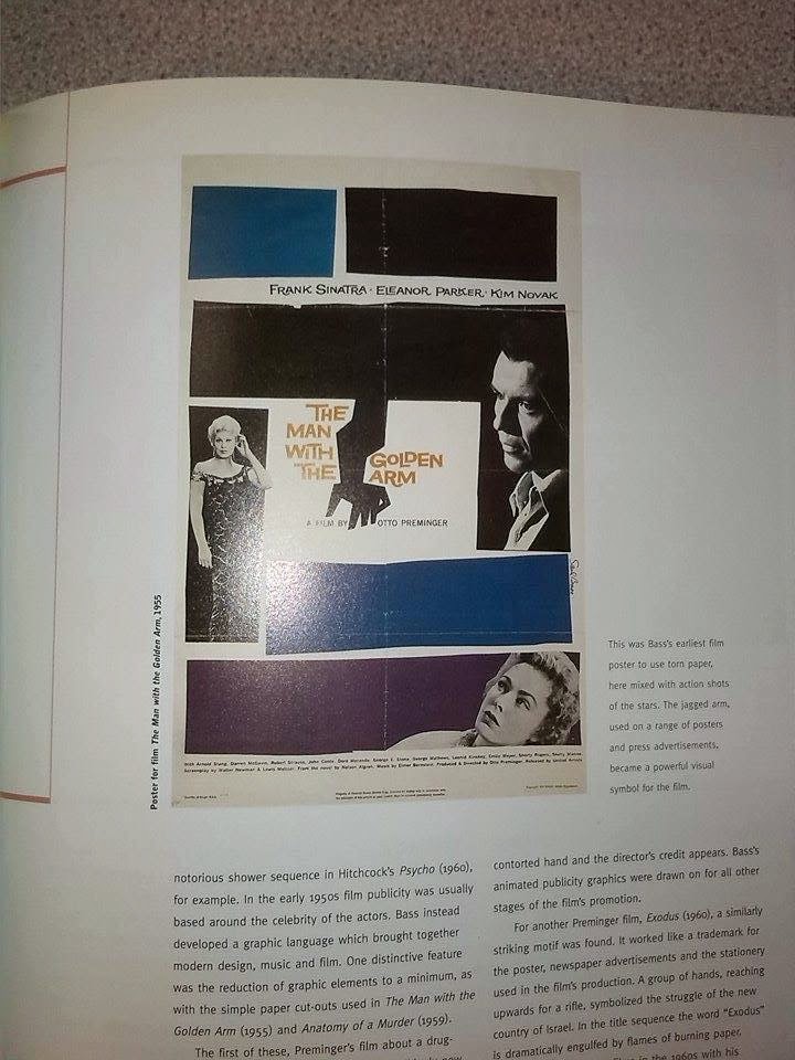
Saul Bass
American logo designer and designer of film graphics. Revolutionized film graphics and is most known for his work with Alfred Hitchcock and Otto Preminger.
Bauhaus School
Walter Gropius
Herbert Bayer
Lester Beall
Beall was an ad man who did work for Caterpillar and Upjohn. His work is marked by the frequent use of arrows. He made the logos of International Paper and Stanley.
Marcel Breuer
Alexey Brodovitch
Brodovitch was an emigre designer who worked for Harper's Bazaar. He is also known for his chairs made of dowels.
Neville Brody
Brody is a Deconstructivist typographer, known for his U.S. postage stamps and work for Nike.
- Ludwig Mies van der Rohe
- Laszlo Moholy-Nagy
- David Carson
- Art Chantry: posters and album covers
Chermayeff & Geismar
This firm has done work for Chase Manhattan, Best Stores, Univision, and the American Bicentennial campaign. They created the Warner Communications "eye & ear" logo, and Mobil's "big red O" logo. They also designed miniature replicas of the Statue of Liberty.
Seymour Chwast
Chwast was a co-founder of Push Pin Studios. He designed Push Pin's newsletter and logos. He is also known for his anti-war posters.
Doyle Dane Bernbach
Bill Bernbach created memorable campaigns for Ohrbach's and Levy's. He thought up Avis's "We're #2!" campaign.
This firm did work for Volkswagen and Uniroyal, and created the famous Juan Valdez character.
- Henry Dreyfuss
Charles & Ray Eames
Charles and Ray Eames created innovative and artistic chair designs among many other things, including a case study house.
Shepard Fairey
Fairey is a modern street artist, who gained fame for his iconic "OBEY Giant" logo, and his Barack Obama posters designed for the 2008 US Presidential election.
Frank Gehry
Gehry is an architect and furniture designer. He has made furniture made of cardboard. He designed the "dancing" "Ginger & Fred" building, the Experience Music Project, and the Disney Music Center. He collaborated with Claes Oldenburg and Coosje van Bruggen on the Chiat/Day Building, which has an entryway shaped like a pair of binoculars. His most famous building is the Guggenheim Museum Bilbao.
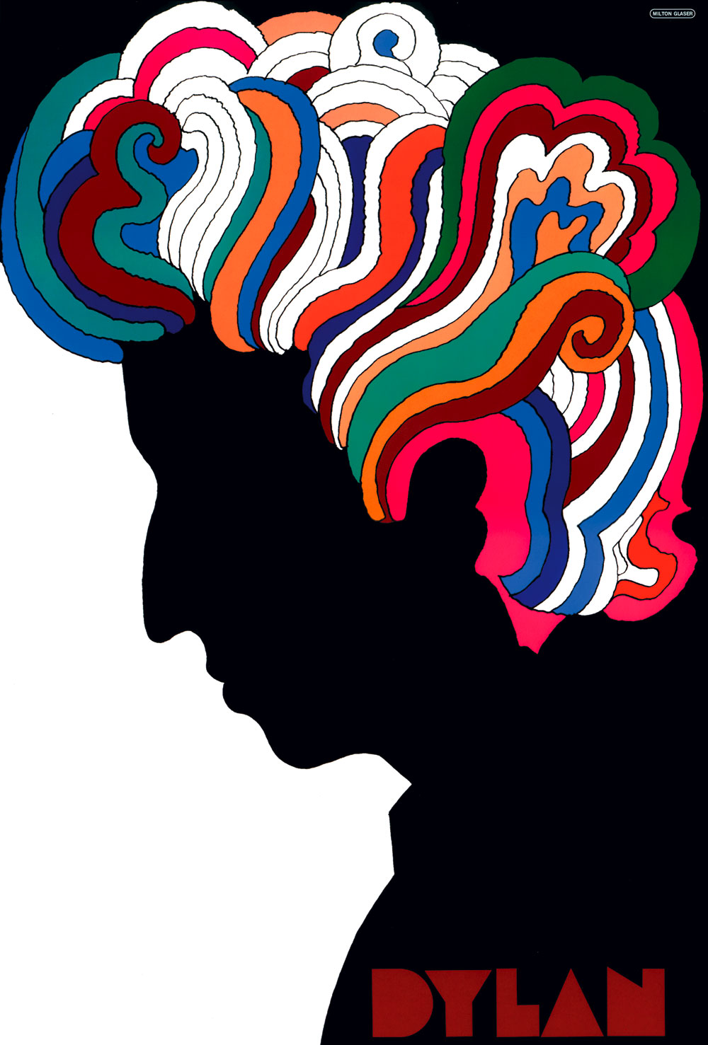
Milton Glaser
Glaser was an expressionist who co-founded Push Pin Studios. His typefaces include Glaser Stencil, Rainbow, and Baby Teeth. He is best known for his "I (heart) NY" campaign. He is also the designer of the Childcraft toy store in New York, and the Rainbow Room in Rockefeller Center.
Michael Graves
Graves is a postmodernist architect and product designer. Structures that he is known for include the Portland Building, the Clos Pegase winery, the San Juan Capistrano library, the Humana building, the Best building. He was in charge of the restoration of the Washington Monument, and designed the Swan and Dolphin Resort at Walt Disney World in Florida. Graves has designed over 800 products sold through Target stores, from alarm clocks to toasters.
April Greiman
Greiman is a New Wave post-modernist who uses "hybrid imagery." She was one of the first designers to embrace the Apple Macintosh as a design tool. She is best known for her centerfold design for Design Quarterly, which was a complex collage and nude self-portrait.
Steven Heller
Self schooled, Author of over 80 books about design.
Takenobu Igarashi
Igarashi creates scultures of numbers and letters, and has done work for NeoCon and PARCO.
Yusaka Kamekura
Kamekura has done graphic design for Nippon magazine, Nikon, Expo '70, and the Sapporo Olympic Winter Games.
Lippincott-Margulies
This firm created the term "corporate identity." They have done work for Pizza Hut, CITGO, Del Monte, American Express, United Tech, Chevron, 76, RCA, Hardee's, Chrysler, American Airlines, Infiniti, Continental, and numerous banks. They designed the new Amtrak logo, the Cadillac Allante, and the look of Duracell coppertop batteries.
Raymond Loewy
Loewy believed that every object had an ideal form that would increase sales. He was a pioneer of streamlining.
His designs were used in Skylab and the Concorde. He also did work for Harper's Bazaar, Greyhound's logo and busses, the Studebaker, Lucky Strike, Coca-Cola, NASA, and Exxon. He created the Coast Guard's logo, and the new logos for Shell and BP.
George Lois
Lois is known for his "conversation ads." His design strategy was "Big Idea and Street Talk." He created covers for Esquire magazine, USA Today's 5-year anniversary campaign, and Naugahyde's Nauga mascot.
- Ellen Lupton: Modern typography enthusiast and formalist
Alvin Lustig
Lustig designed book covers and ads for Knoll.
- Joseph Muller-Brockmann: Pioneer of Swiss Graphic Design
Eliot Noyes
As a Harvard trained architect and industrial designer Noyes became the pioneer of Corporate Design in the development of comprehensive corporate-wide design programs that integrated both design strategy and business strategy. He and is firm were commissioned regularly by IBM, most famously the IBM Selectric typewriter and the IBM Aerospace Research Center in Los Angeles, California. Noyes collaborated with Paul Rand, Charles Eames and hired Chermayeff & Geismar for clients that included Mobil Oil, Cummins Engine and Westinghouse.
Paul Rand
The four stages of Rand's career were 1) Magazine covers and promotion, 2) Ads (1941-1954), 3) Corporate identity, and 4) Teaching (at Cooper, Pratt, and Yale). He's done work for IBM, Direction magazine, Westinghouse, Cummins, NeXT, Morningstar, and Ford (a logo which was rejected).
- Kurt Schwitters: Dadaist and pioneer of collage
Ladislav Sutnar
Sutnar designed Sweet's catalogs. His work often uses the Futura typeface. His design strategy was the "three Fs": Function, Flow, and Form.
Ikko Tanaka
Tanaka was a famous abstract poster designer.
Bradbury Thompson
Thompson was a typographer. Arguing that it was confusing to have two symbols for one letter, he created "alphabet 26", a set of letters which had only one case. He did work for the Smithsonian magazine, and designed editions of The Red Badge of Courage and the Holy Bible.
Andy Warhol
Wes Wilson
Wilson is famous for his psychedelic rock posters and extremely complex lettering.
Frank Lloyd Wright
I also looked at a few books from the library to get a better depth of research and to find more iconic posters from specific countries:


Japanese Design
Source: http://guity-novin.blogspot.co.uk/2012/11/chapter-62-modern-graphic-design-in.html


French Design
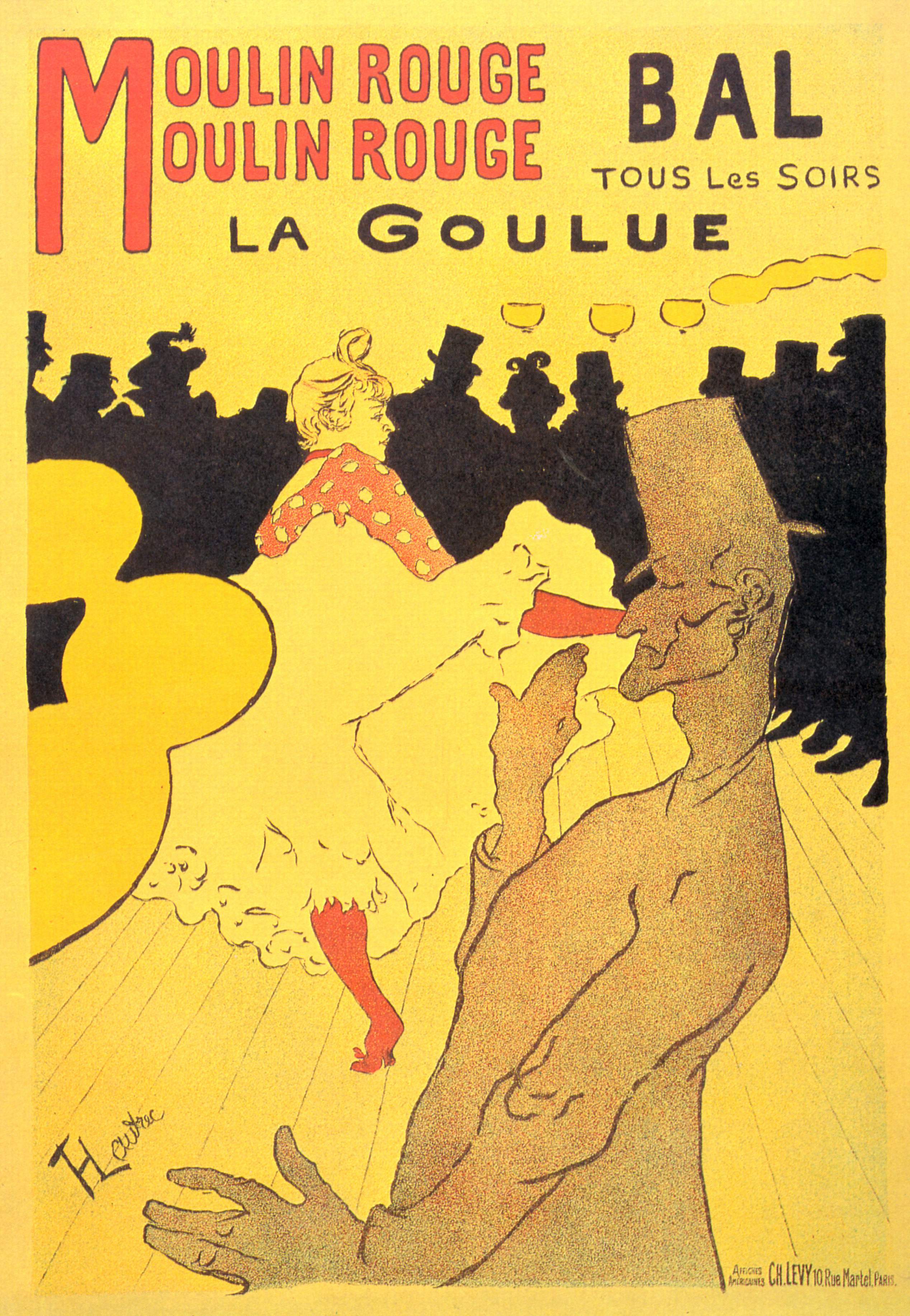
The french style is distinguishable by its art around late 1800 and early 1900's from posters like 'Moulin Rogue'.


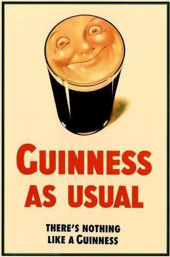
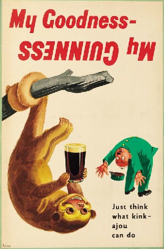
British Design
Alan Fletcher
Alan Gerard Fletcher (27 September 1931 – 21 September 2006) was a British graphic designer. In his obituary, he was described by The Daily Telegraph as "the most highly regarded graphic designer of his generation, and probably one of the most prolific".


John Thomas Young Gilroy
John Thomas Young Gilroy (30 May 1898 – 11 April 1985) was an English artist and illustrator, best known for his advertising posters for Guinness, the Irish stout.


More British design which is distinctively British:
Tom Eckersley


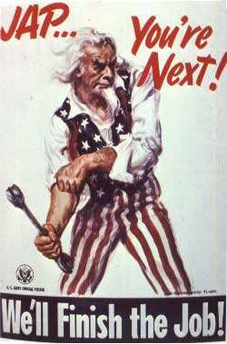
American Design
American design can be distinguished by graphic designers like Paul Rand and also Massimo Vignelli, although he is not American.

James Montgomery Flagg


Russian Design
Russian design is very renowned for being very industrial, and also it's recognisable by the language and the glyphs used.
Rodchenko


So after looking at different recognisable styles I've chosen five to work with which I think best represent a style/ country.
British Design:
I chose to use one of the guinness posters for British design. They are very iconic and recognisable.

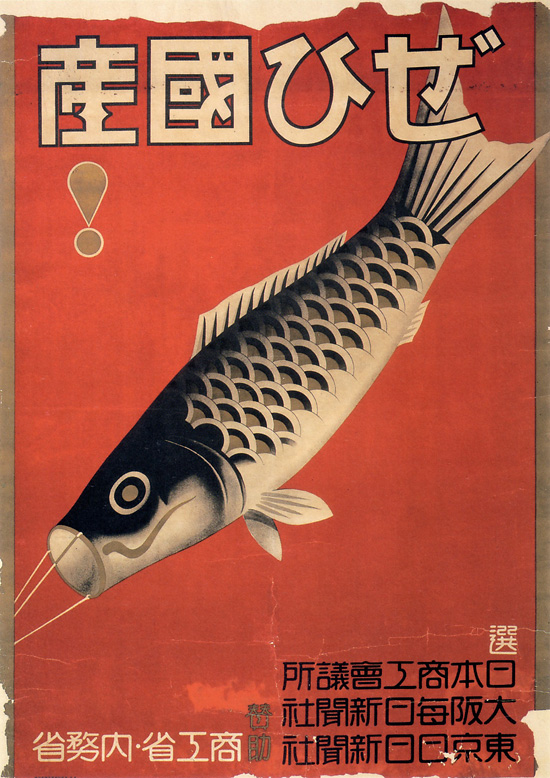
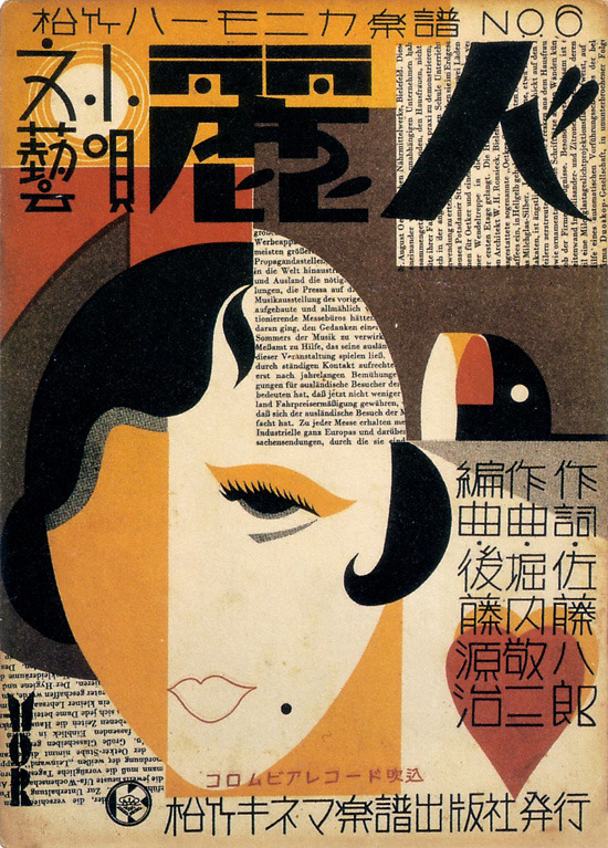
Japanese Design:
I chose this classic piece of Japanese design, which translates to 'Buy Domestic!'.

American Design:
This is a very recognisable peace of american design that I think best represents a lot of classic American design/ art.

Russian Design:
Rodchenkos poster for pacifiers/ dummies:
Aleksandr Rodchenko (text by Vladimir Mayakovsky), “There was no better and there are no better baby dummies...,” advertising poster for the Rezinotrest (“Rubber Trust”) company, 1923
It's an add for pacifiers. It says [roughly] "There have never been, and never will be, better pacifiers than these" "Ready to suck on them to old age" and then "sold everywhere", and I assume the name of the store or the manufacturing brand? (the word for "nipple" and "pacifier" is similar, especially in the altered grammatical forms, but the emphasis on vowels in speech is different)
But in Moscow, the Rezinotrest (Rubber Trust) posters were pure Futurism! Pacifiers ad, by Rodchenko & Mayakovsky.
Alexander Rodchenko Avertising Poster for pacifiers.
French Design:
I also chose the Moulin Rouge poster, as it is unmistakably French.

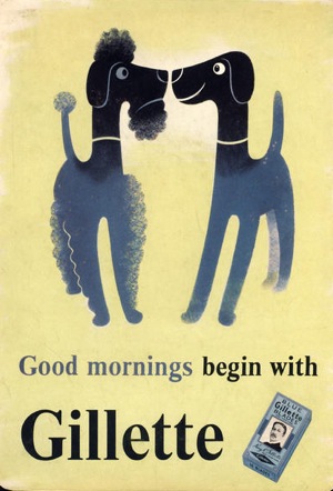
I also looked at swiss style/ International style to get a greater understanding of the style its self.


Other Russian design:

British Design:
I chose to use one of the guinness posters for British design. They are very iconic and recognisable.
Japanese Design:
I chose this classic piece of Japanese design, which translates to 'Buy Domestic!'.
American Design:
This is a very recognisable peace of american design that I think best represents a lot of classic American design/ art.
Russian Design:
Rodchenkos poster for pacifiers/ dummies:
Translations:
Aleksandr Rodchenko (text by Vladimir Mayakovsky), “There was no better and there are no better baby dummies...,” advertising poster for the Rezinotrest (“Rubber Trust”) company, 1923
It's an add for pacifiers. It says [roughly] "There have never been, and never will be, better pacifiers than these" "Ready to suck on them to old age" and then "sold everywhere", and I assume the name of the store or the manufacturing brand? (the word for "nipple" and "pacifier" is similar, especially in the altered grammatical forms, but the emphasis on vowels in speech is different)
But in Moscow, the Rezinotrest (Rubber Trust) posters were pure Futurism! Pacifiers ad, by Rodchenko & Mayakovsky.
Alexander Rodchenko Avertising Poster for pacifiers.
“There never was a better pacifier So good I could suck on it ‘til I retire”
Sold Everywhere. Made by Rubber Trust.
Sold Everywhere. Made by Rubber Trust.
French Design:
I also chose the Moulin Rouge poster, as it is unmistakably French.
I also looked at swiss style/ International style to get a greater understanding of the style its self.
Swissted
http://www.swissted.com


No comments:
Post a Comment