Brief Below:

Cheese Products already supplied by G&K Foods:


Existing Cheese Labels:


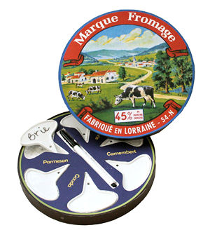


The cheese labels I found come across very old fashioned, but I think it creates a great aesthetic. I think a lot of the time its the style of the illustration which makes it look quite traditional. None of them use relay photography, they're all big bold, they tell you what they need, the hierarchy works well and overall they are very aesthetically pleasing. Colours vary, some are very limited some are quite colourful. I think I like the ones with less colour as theres less to take in, and when looking at a cheese packaging you want to appreciate the design but at the same time not really take notice of it, your more interested in what type of cheese it is.
Australian coast line:


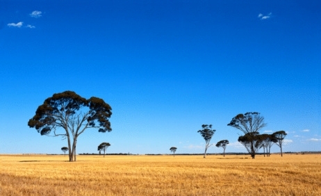
I've been asked to incorporate rolling hills into my design as they are reflective of the australian country side.
No comments:
Post a Comment